Key Takeaways
- The mosque’s “blue” reputation comes mainly from interior tile tones and light, not from a blue exterior.
- İznik tiles are ceramic tiles made in Ottoman İznik workshops, prized for crisp floral designs and rich mineral colors.
- Sedefkar Mehmed Ağa is the architect usually credited with the mosque, commissioned by Sultan Ahmed I.
- The interior works because tiles, windows, calligraphy, domes, and massive piers are arranged in a clear visual order.
- Blue Mosque entry is FREE, but prayer times and visitor access rules can change, so check current arrangements before you go.
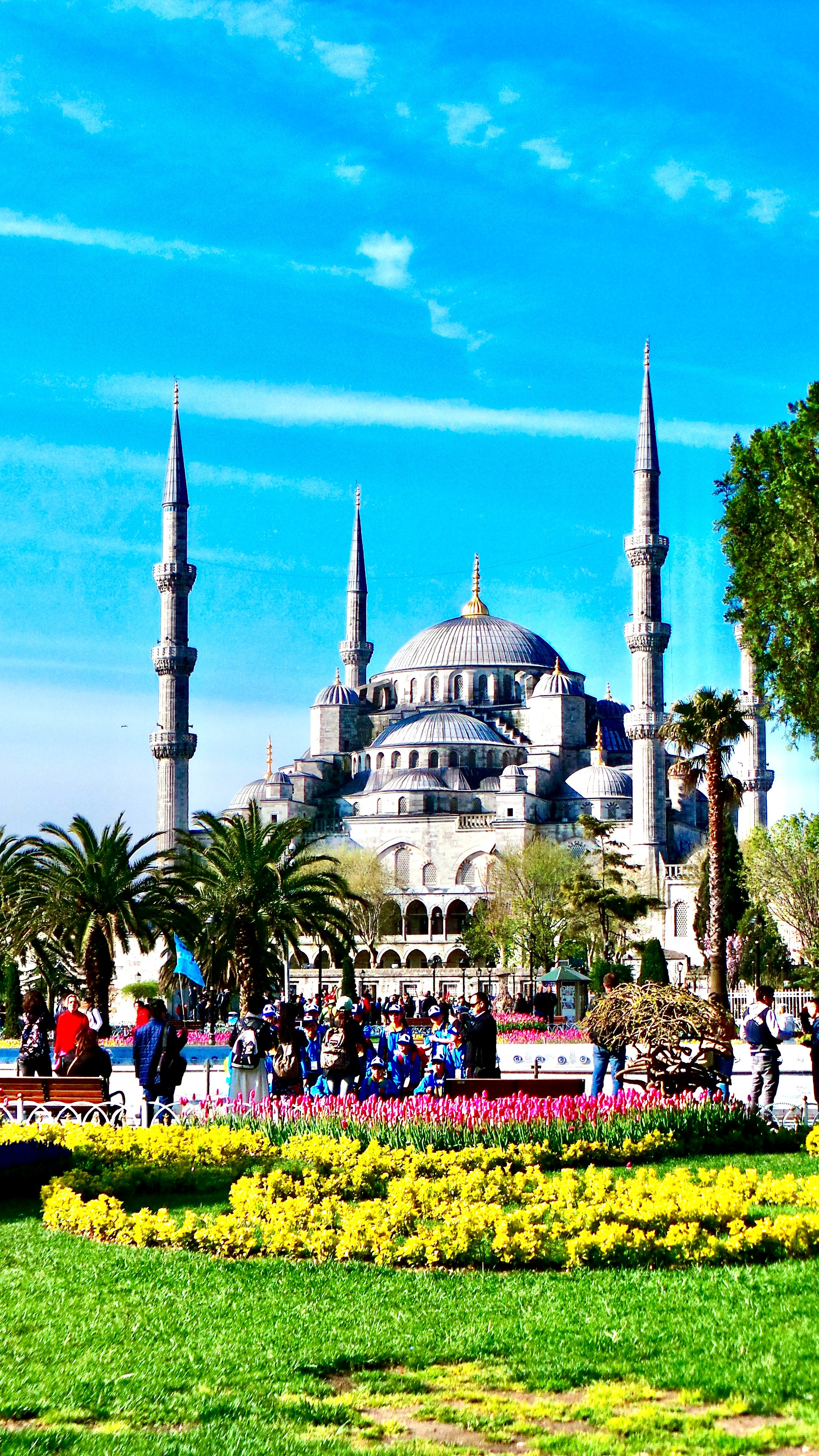
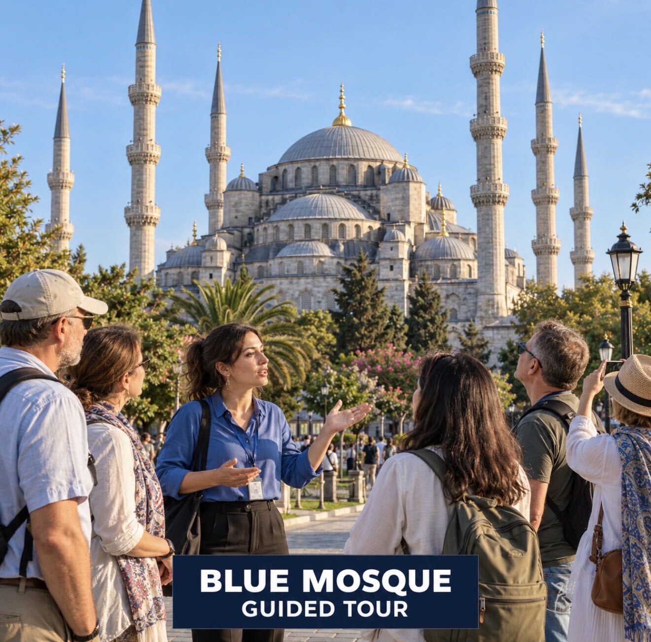
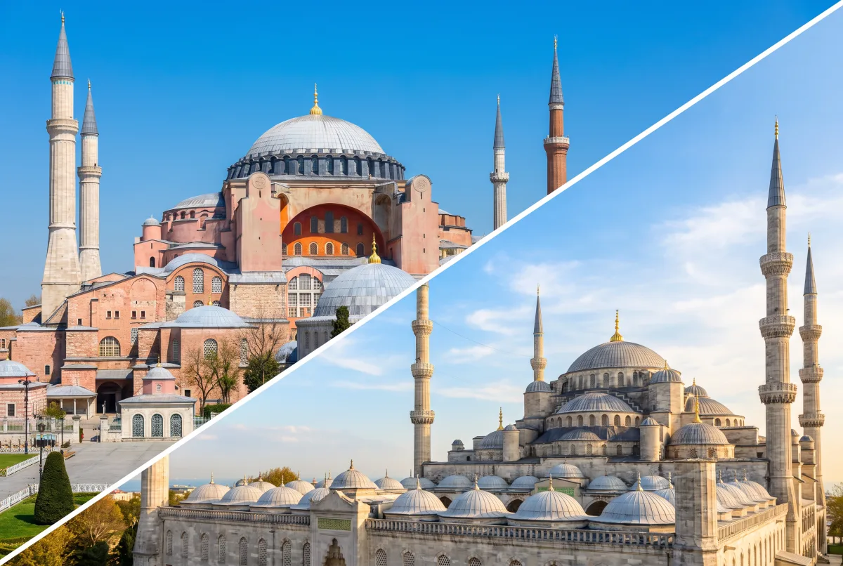
The Blue Mosque is the common name for Sultan Ahmed Mosque, an imperial Ottoman mosque facing Sultanahmet Square in Istanbul. Sultanahmet is the city’s historic district where several major monuments stand within a short walk, including Hagia Sophia.
Many first-time visitors expect walls covered evenly in blue tile from floor to dome. Instead, the interior is more selective. Tiles gather on lower walls, galleries, and key surfaces, while the upper space opens into stone, script, windows, and a rising chain of domes.
That distribution is what makes the building convincing. Decoration never fully hides structure, so you read both at once: engineering below, ornament at eye level, and a spacious dome system above.
Blue Mosque Architecture: What Makes It Distinctive
Ottoman architecture is the building tradition developed under the Ottoman Empire, especially visible in mosques, palaces, fountains, and civic complexes. The Sultan Ahmed Mosque belongs to the imperial-mosque tradition that aimed to create one commanding congregational space under a dominant dome.
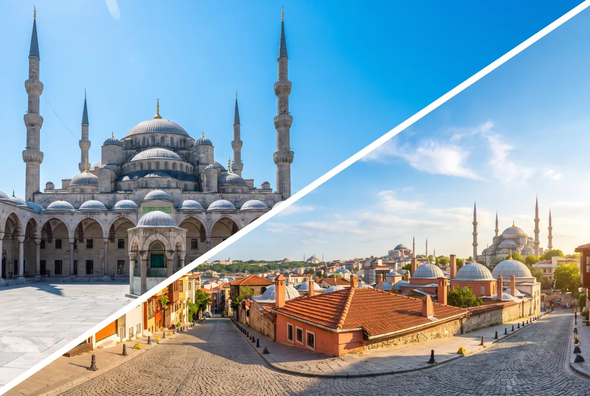
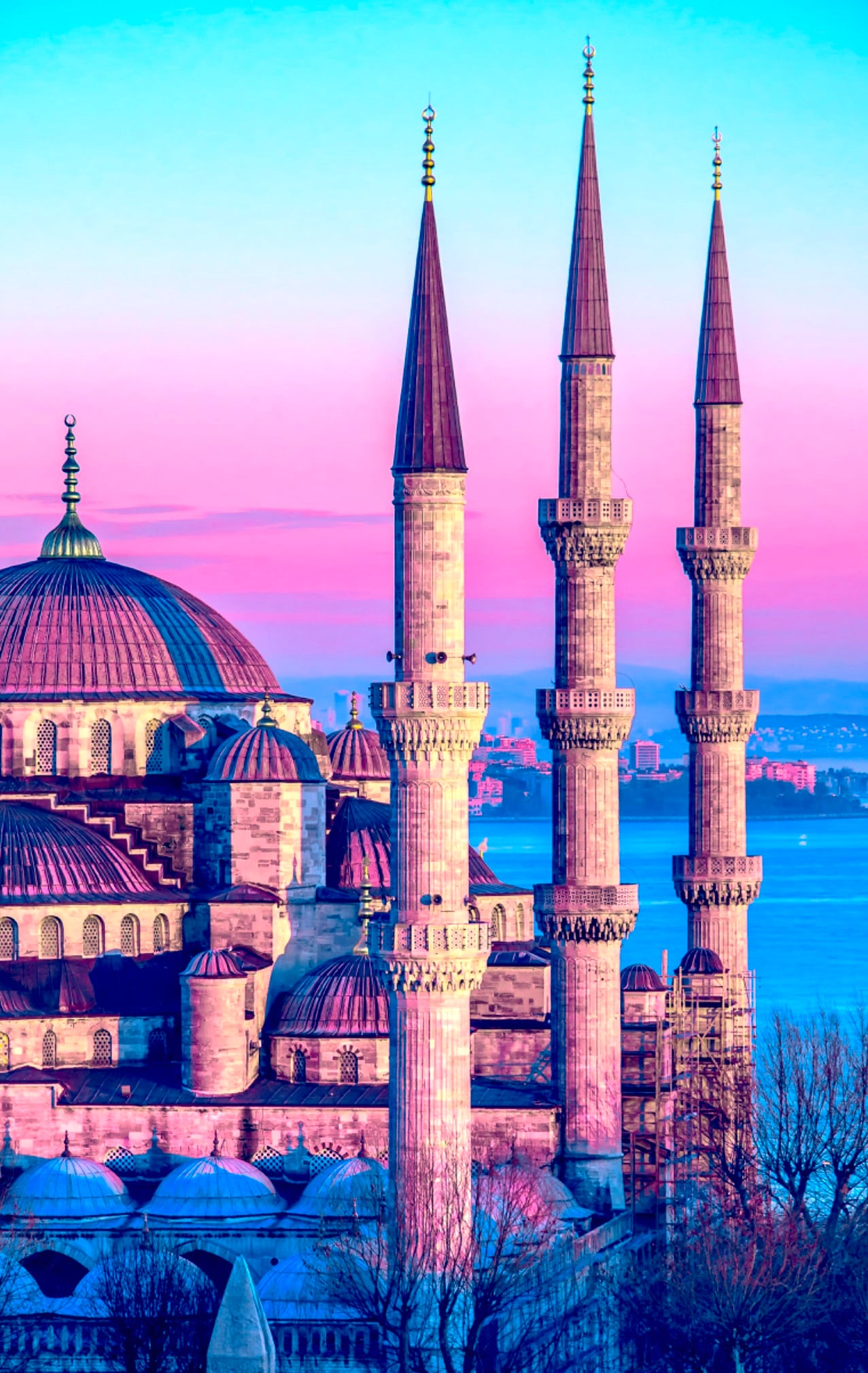
What makes this mosque distinctive is the combination of a central dome, cascading semi-domes, six minarets, patterned tile surfaces, and daylight that keeps the interior legible. The effect is ceremonial, but also unusually easy to read for first-time visitors.
The plan continues a long Ottoman effort to unify large prayer halls into one flowing volume. Here, four huge piers carry the main loads, semi-domes step outward from the center, and smaller exedrae soften the transitions between major structural parts.
The eye rises quickly, but it does not lose contact with the lower decorative zone. That is one reason the mosque feels ordered rather than crowded.
The often-repeated claim is that the Blue Mosque has around 20,000 İznik tiles. That figure helps explain the scale of the decorative program, but not the design logic. The tiles do not cover every surface evenly. They are concentrated where people look most closely, then give way to calligraphy, windows, and stone as the architecture climbs.
The exterior prepares you for the same idea. From the square, the dome system descends in stages, while the minarets sharpen the skyline. The building reads as broad, formal, and dynastic.
If you have just visited Hagia Sophia, the contrast is useful. Hagia Sophia impresses through age, structural daring, and layered history. The Blue Mosque feels more planned as a complete Ottoman imperial interior.
Why the İznik Tiles Matter
İznik is the historic town in northwestern Türkiye where elite Ottoman ceramics were produced in renowned workshops. İznik tilework is a decorative ceramic art known for quartz-rich bodies, bright white grounds, and floral or geometric designs.
The tile scheme is central to the mosque’s identity, but not because every panel is the same. Different zones use different rhythms, motifs, and color balances. You will see tulips, carnations, roses, vines, and cypress-like forms arranged in repeating fields and framed panels.
The best-known colors are cobalt blue, turquoise, green, and red accents, including the deep coral-red that İznik potters became famous for. Up close, the tiles read as precise botanical designs. From farther back, they merge into cool color bands that anchor the lower interior.
The Colors, Patterns, and Placement
Placement matters as much as craftsmanship. The lower walls and gallery zones receive the densest tile treatment because that is where visitors spend most of their visual attention. Higher up, painted decoration, calligraphy, and the dome geometry take over.
This creates a visual gradient: heavier pattern below, lighter architectural space above.
There is a practical reason too. Tile holds up well near human contact and rewards close inspection better than painted plaster. The surfaces nearest the visitor therefore carry some of the richest detail.
The popular claim is that the mosque contains about 20,000 tiles. Use that number as a rough guide rather than a precise explanation of why the room works.
It also helps to remember that the nickname “Blue Mosque” can oversimplify the palette. Blue is important, but so are green, white, and warmer accents. Light changes the color balance throughout the day, which is why the interior rarely looks identical from one photograph to the next.
How the Domes, Semi-Domes, and Piers Work Together
A dome is a rounded roof structure that spans space from above. A semi-dome is a half-dome used to extend and support a central domed volume. A pier is a massive vertical support, thicker and more structural than a column.
The prayer hall follows a clear structural idea: gather the main space under one dominant dome, then distribute the loads through semi-domes and heavy supports. This was a mature Ottoman solution, and the Blue Mosque applies it on an imperial scale.
Visitors usually notice the dome first, but the piers do much of the hard work. They are enormous, yet handled so the room does not feel broken into compartments. Wide arches and continuous surfaces help absorb them into the total composition.
Look for the upward progression. A main dome covers the core space. Semi-domes extend that center. Smaller domed units and exedrae smooth the outer edges. The ceiling reads as one descending family of forms rather than disconnected parts.
This matters emotionally as well as structurally. A fragmented ceiling can make a large hall feel unsettled. Here, the dome cascade steadies the eye and gives the interior both momentum and rest.
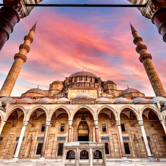
For comparison, pair this visit with the Süleymaniye Mosque. Süleymaniye shows an earlier imperial mastery of domed clarity; the Blue Mosque pushes further into decorative richness.
Light, Calligraphy, and the Feeling of Space
Calligraphy is decorative writing used in Islamic art and architecture, often carrying Qur'anic text or devotional phrases. Stained glass is colored glass set into windows, though; most of the mosque's original 17th-century glass has been lost, and the windows you see today are largely later replacements.
One reason the interior feels softer than many photos suggest is light. Windows cut through the walls and drum zones, breaking up heavy masonry and washing the room with a diffuse glow. On bright days, the tiles can look cooler; in lower light, the space feels quieter.
Calligraphy does a different job. It frames openings, marks transitions, and gives the eye a script band to follow where the tile fields stop. Rather than competing with the architecture, it links decorative zones together.
This is where many visitors slow down. Instead of checking off individual features, you start noticing relationships: dark script against pale ground, tile against gray stone, daylight against the depth of the dome.
The interior atmosphere is built through coordination. Light loosens the weight of stone. Calligraphy takes over where tile would be too much. The dome system gathers everything into one upward motion. Even the giant piers become part of a larger rhythm.
What to Look for on Your Visit
If you want to understand the interior quickly, do not start with the main dome. Start at eye level. Study one tile panel, then lift your gaze to the calligraphy band, then to the windows, then to the rising vaults. That sequence makes the design easier to read.
Next, move sideways rather than only forward. As your angle changes, the piers hide and reappear, and the semi-domes feel larger or smaller. The room becomes more understandable in motion.
Also notice what is not tiled. Quieter surfaces are deliberate. They stop the interior from tipping into visual overload.
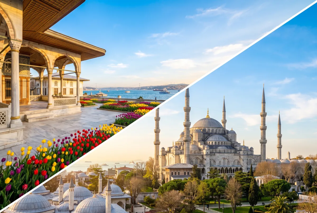
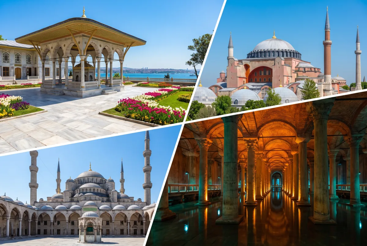
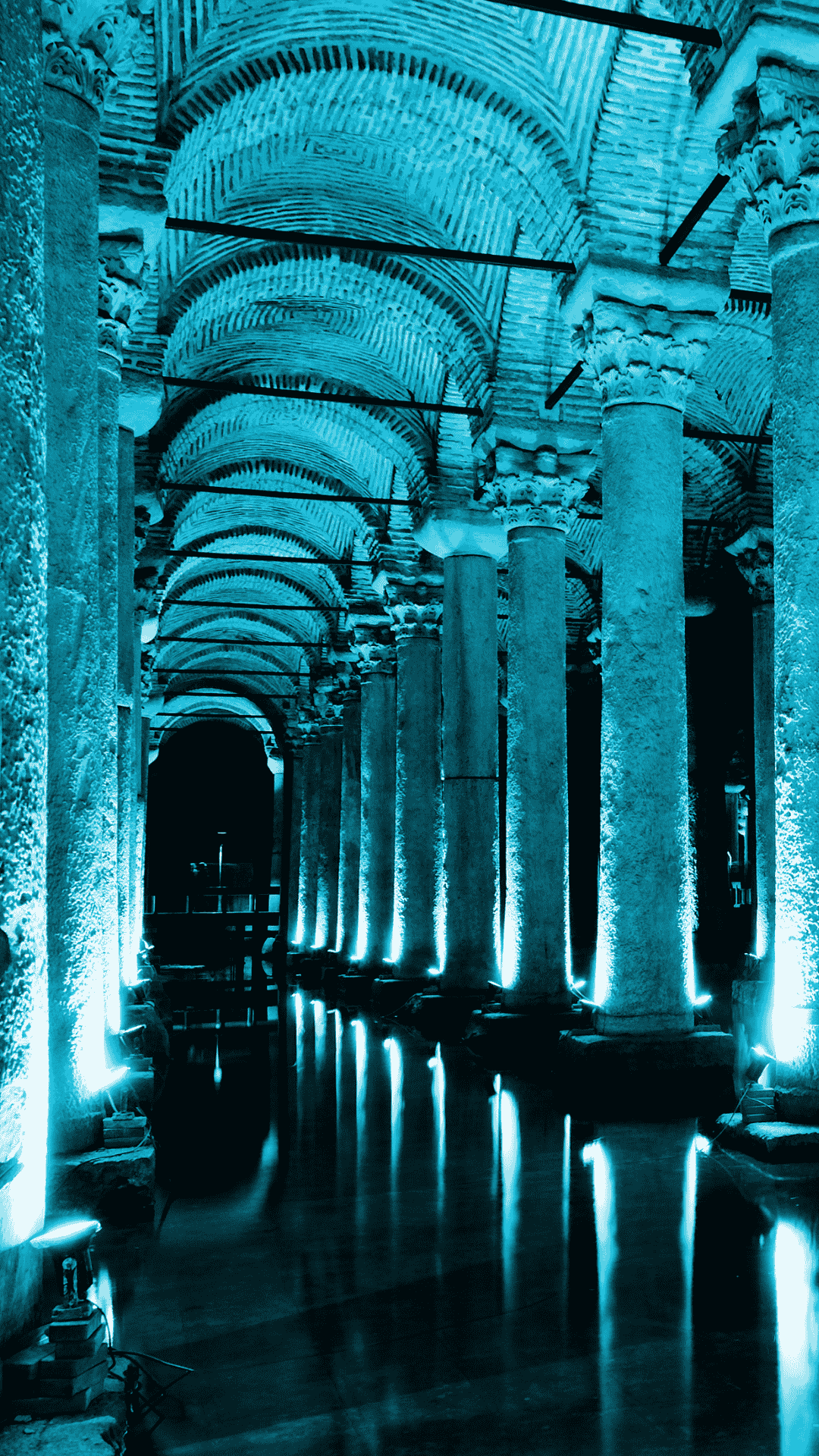
For a broader district walk, combine the mosque with the nearby Basilica Cistern and Topkapi Palace. For neighborhood planning, see our guide to things to do in Sultanahmet.
Practical Visiting Notes
Blue Mosque entry is FREE. It remains an active place of worship, so visitor access may pause during prayer times.
Dress respectfully and expect standard mosque etiquette: clothing that covers shoulders and knees, plus a head covering for women (scarves are usually handed out at the entrance). Shoes are removed before entering the prayer area and carried in a plastic bag provided at the door. For a fuller explainer, link this page to your visiting rules and dress code guide.
The mosque has gone through restoration phases in recent years, and the exact visual experience may differ from older photographs; a major restoration wrapped up in recent years, so the interior is once again fully open.
If you want lighter crowds, aim for a quieter part of the day rather than the busiest mid-morning windows — early morning right after opening, or later in the afternoon, and always plan around the five daily prayer times.
Blue Mosque vs Hagia Sophia vs Süleymaniye
Comparison is useful because these three landmarks solve similar problems in different ways.
Hagia Sophia is a former Byzantine church and later imperial mosque known for its vast central volume, massive structural drama, and layered history. Süleymaniye Mosque is Sinan’s grand imperial mosque, known for clarity, proportion, and restraint. The Blue Mosque is an Ottoman imperial mosque that emphasizes coordinated decoration, readability, and ceremonial presence.
Quick Comparison
- Best for historical depth: Hagia Sophia
- Best for decorative Ottoman atmosphere: Blue Mosque
- Best for structural clarity and proportion: Süleymaniye Mosque
What Each One Feels Like
- Blue Mosque: More decorative, more color-driven, and often easier for visitors to read as a complete Ottoman design.
- Hagia Sophia: Older, heavier, and more dramatic in structural terms, with a stronger sense of historical layering.
- Süleymaniye: More restrained and measured, with exceptional compositional control and a calmer monumentality.
What to Focus On Inside
- Blue Mosque: Tile placement, calligraphy bands, filtered light, and how the lower decoration gives way to the dome system.
- Hagia Sophia: The scale of the central volume, the suspension of the great dome, and the building’s Byzantine-Ottoman layers.
- Süleymaniye: Proportion, structural calm, and the disciplined balance between open space and support.
Which One Should Architecture Lovers Prioritize?
- Choose Hagia Sophia if you care most about engineering drama and historical transformation.
- Choose Süleymaniye if you want the clearest lesson in classical Ottoman proportion.
- Choose the Blue Mosque if you want to see how Ottoman imperial design unites color, light, structure, and public image in one highly legible interior.
That is why the tiles matter, but also why the article should not stop with the tiles. They are one instrument in a carefully controlled room.
The Blue Mosque is best understood not as a blue interior covered in ornament, but as a disciplined Ottoman composition built by Sultan Ahmed I’s court architect to guide the eye from detail to structure to light.